Research report on predicting Deutsche Bahn arrival delays with Linear Regression, KNN, and Random Forest across 2,061,357 timetable records.
Authors
Affiliation
Alexander Rudaev
TH Deggendorf
Sameer Kumar
TH Deggendorf
Fares Elbermawy
TH Deggendorf
Published
August 8, 2025
Abstract
We trained three regression models — Linear Regression, K-Nearest Neighbors, and Random Forest — to predict Deutsche Bahn arrival delays from 2,061,357 historical timetable records. Feature engineering focused on temporal patterns and station-level aggregation rather than one-hot encoding, avoiding the curse of dimensionality across hundreds of station categories. Forward stepwise selection identified the optimal feature subset, and model selection used a held-out validation set. The best model — Random Forest — achieved a test MSE of 0.8791 (RMSE: 0.938 minutes), a 92.4% reduction over the naive mean-prediction baseline. Departure delay is the dominant predictor, followed by station-level historical delay risk and time-of-day effects.
Computation environment
All ML training was performed in Google Colab with GPU acceleration (n_jobs=-1). Source notebook: notebooks/analysis.ipynb — open it in Colab to reproduce all results. This document shows the code for reference; figures and metrics are pre-computed outputs committed to the repository.
1. Why Predict Train Delays?
Deutsche Bahn carries roughly 5.5 million passengers per day across a network of over 5,700 stations. Delays cascade: a late intercity train holds connections, and a single disrupted corridor can ripple for hours. For passengers, even a 2-minute prediction window matters. For DB operations, knowing which trains are likely to be late before departure enables proactive crew and platform reassignment.
This project frames delay prediction as a supervised regression problem: given what we know about a train’s scheduled departure — its route, station history, time of day — can we predict its arrival delay in minutes?
2. Statistical Learning Framework
We model the relationship between predictors and response following ISLR Chapter 2.1 (James et al. 2023):
\[Y = f(X) + \epsilon\]
where:
\(Y\) is the response (arrival delay in minutes)
\(X = (X_1, X_2, \ldots, X_p)\) is our vector of \(p\) predictors
\(f\) is the unknown systematic function we aim to estimate
\(\epsilon\) is irreducible error with \(E[\epsilon] = 0\)
Our goal is to find \(\hat{f}\) such that \(\hat{Y} = \hat{f}(X)\) minimises the expected prediction error:
No matter how well we estimate \(f\), we cannot reduce MSE below \(\text{Var}(\epsilon)\) — the irreducible noise in the system.
Note
Why three models? Linear Regression, KNN, and Random Forest sit at very different points on the bias-variance spectrum. Comparing all three lets us diagnose whether the problem is better solved by a flexible or a constrained model class.
The dataset comes from Kaggle (nokkyu 2024) and contains per-train-stop records of planned vs. actual arrival and departure times across the Deutsche Bahn network.
# Remove duplicatesdf = df.drop_duplicates()# Drop rows missing target or critical featurescritical = ['arrival_delay_m', 'station', 'line', 'state', 'category', 'departure_delay_m']df = df.dropna(subset=critical)# Fill remaining missing valuesfor col in df.select_dtypes(include=['object']).columns: df[col] = df[col].fillna('Unknown')for col in df.select_dtypes(include=['int64', 'float64']).columns:if col !='arrival_delay_m': df[col] = df[col].fillna(df[col].median())
Figure 1: Distribution of arrival delays. Most trains arrive on time or within a few minutes, but the right tail extends well past 60 minutes.
The distribution is right-skewed: most values cluster near zero, but extreme delays push the mean above the median. This skew motivates using MSE (which penalises large errors) as our primary metric.
6. Feature Engineering
Rather than one-hot encoding hundreds of station categories (which would explode dimensionality — the “curse of dimensionality” (James et al. 2023) § 2.2), we build compact, domain-informed features.
Important
Correlation-based feature selection would be wrong here. Selecting features purely by their correlation to the target ignores multicollinearity, overfits to the training distribution, and discards domain knowledge. We engineer features based on what we know about train delays first, then use forward selection to prune them.
6.1 Temporal Features
df['hour'] = df['departure_plan'].dt.hourdf['day_of_week'] = df['departure_plan'].dt.dayofweekdf['is_weekend'] = (df['day_of_week'] >=5).astype(int)df['is_rush_hour'] = df['hour'].apply(lambda x: 1if (6<= x <=9or16<= x <=19) else0)
The test set is locked away and never touched until the very end.
9. Preventing Data Leakage
Data Leakage
If you fit StandardScaler on the full dataset before splitting, your scaler has seen the validation and test distributions. The resulting performance estimate will be optimistic. Always fit transformers on training data only.
numerical_features = X_train.select_dtypes(include=['int64','float64']).columns.tolist()categorical_features = X_train.select_dtypes(include=['object']).columns.tolist()preprocessor = ColumnTransformer(transformers=[ ('num', StandardScaler(), numerical_features), ('cat', OneHotEncoder(drop='first', sparse_output=True, handle_unknown='ignore'), categorical_features)], remainder='drop')preprocessor.fit(X_train) # Fit on training data ONLY
At step \(k\), we fit \(p - k\) candidate models and keep the one with the lowest validation MSE. Total cost: \(O(p^2)\) model fits, versus \(O(2^p)\) for exhaustive best-subset search.
Figure 4: Linear Regression residual diagnostics. Left: residuals vs fitted values show a funnel shape (heteroscedasticity). Right: Q-Q plot departs from the diagonal at the tails — normality assumption is partially violated.
The residual plots reveal heteroscedasticity and non-normality in the tails — OLS assumptions are partially violated, motivating more flexible models.
11.2 K-Nearest Neighbors
KNN predicts by averaging the \(K\) nearest training examples:
Figure 5: Learning curves for Random Forest. The small train-validation gap and low final validation error indicate a well-balanced model (low bias, controlled variance).
14. Results: 92.4% Improvement Over Baseline
Random Forest achieved a test MSE of 0.8791 — a 92.4% reduction from the naive mean-prediction baseline (MSE: 11.50).
We retrain on the combined train + validation data before final evaluation, maximising the data available for fitting without contaminating the held-out test set.
Figure 6: Final model residuals on the held-out test set. Left: residuals vs fitted values. Right: Q-Q plot.
Key Findings
Departure delay dominates: a train that departs late almost always arrives late — both the strongest predictor and the most actionable signal for operations.
Station aggregation beats one-hot encoding: collapsing hundreds of station categories into two numeric features (mean delay, std delay) achieved better generalisation with a smaller feature space.
Rush-hour effects are real but modest: time-of-day contributes, but departure delay explains the majority of variance.
Random Forest generalises best: it can model non-linear interactions without explicitly specifying them.
15. Limitations and Future Work
i.i.d. assumption violated: Random shuffled splits ignore temporal autocorrelation in delay data. Temporal cross-validation would give a more honest estimate.
Distribution shift: Network changes or scheduling reforms after the training period will degrade performance.
Irreducible error: Even a perfect \(f\) cannot reduce MSE below \(\text{Var}(\epsilon)\) — noise from unpredictable events (weather, incidents).
Missing features: Weather data, planned maintenance windows, and real-time network topology are not included.
Next steps:
XGBoost / LightGBM — gradient boosting typically outperforms Random Forest on tabular data.
Online learning — incremental updates as new delay data arrives.
Temporal CV — time-aware splits for realistic evaluation.
References
James, Gareth, Daniela Witten, Trevor Hastie, Robert Tibshirani, and Jonathan Taylor. 2023. An Introduction to Statistical Learning with Applications in Python. New York: Springer. https://www.statlearning.com.
Developed as part of the Machine Learning course at TH Deggendorf under Prof. Dr. Mayer.
Source Code
---title: "Predicting Deutsche Bahn Train Delays"subtitle: "Supervised Regression on 2,061,357 Records"description: "Research report on predicting Deutsche Bahn arrival delays with Linear Regression, KNN, and Random Forest across 2,061,357 timetable records."image: assets/og-report.pngauthor: - name: Alexander Rudaev affiliation: TH Deggendorf - name: Sameer Kumar affiliation: TH Deggendorf - name: Fares Elbermawy affiliation: TH Deggendorfdate: "2025-08-08"abstract: | We trained three regression models — Linear Regression, K-Nearest Neighbors, and Random Forest — to predict Deutsche Bahn arrival delays from 2,061,357 historical timetable records. Feature engineering focused on temporal patterns and station-level aggregation rather than one-hot encoding, avoiding the curse of dimensionality across hundreds of station categories. Forward stepwise selection identified the optimal feature subset, and model selection used a held-out validation set. The best model — Random Forest — achieved a test MSE of **0.8791** (RMSE: 0.938 minutes), a **92.4% reduction** over the naive mean-prediction baseline. Departure delay is the dominant predictor, followed by station-level historical delay risk and time-of-day effects.---::: {.callout-note}## Computation environmentAll ML training was performed in Google Colab with GPU acceleration (`n_jobs=-1`).Source notebook: [notebooks/analysis.ipynb](notebooks/analysis.ipynb) — open it in Colab to reproduce all results.This document shows the code for reference; figures and metrics are pre-computed outputs committed to the repository.:::---## 1. Why Predict Train Delays?Deutsche Bahn carries roughly 5.5 million passengers per day across a network of over 5,700 stations. Delays cascade: a late intercity train holds connections, and a single disrupted corridor can ripple for hours. For passengers, even a 2-minute prediction window matters. For DB operations, knowing which trains are likely to be late before departure enables proactive crew and platform reassignment.This project frames delay prediction as a **supervised regression problem**: given what we know about a train's scheduled departure — its route, station history, time of day — can we predict its arrival delay in minutes?---## 2. Statistical Learning FrameworkWe model the relationship between predictors and response following ISLR Chapter 2.1 [@islp2023]:$$Y = f(X) + \epsilon$$where:- $Y$ is the response (arrival delay in minutes)- $X = (X_1, X_2, \ldots, X_p)$ is our vector of $p$ predictors- $f$ is the unknown systematic function we aim to estimate- $\epsilon$ is irreducible error with $E[\epsilon] = 0$Our goal is to find $\hat{f}$ such that $\hat{Y} = \hat{f}(X)$ minimises the expected prediction error:$$E\left[(Y - \hat{Y})^2\right] = \underbrace{\left[\text{Bias}(\hat{f}(X))\right]^2}_{\text{reducible}} + \underbrace{\text{Var}(\hat{f}(X))}_{\text{reducible}} + \underbrace{\text{Var}(\epsilon)}_{\text{irreducible}}$$No matter how well we estimate $f$, we cannot reduce MSE below $\text{Var}(\epsilon)$ — the irreducible noise in the system.::: {.callout-note}**Why three models?** Linear Regression, KNN, and Random Forest sit at very different points on the bias-variance spectrum. Comparing all three lets us diagnose whether the problem is better solved by a flexible or a constrained model class.:::---## 3. Setup```{python}#| eval: false#| code-fold: trueimport os, sys, gc, warningsfrom datetime import datetimeimport psutil, pandas as pd, numpy as npimport matplotlib.pyplot as plt, seaborn as snsfrom sklearn.model_selection import ( train_test_split, cross_val_score, GridSearchCV, KFold, PredefinedSplit)from sklearn.preprocessing import StandardScaler, OneHotEncoderfrom sklearn.compose import ColumnTransformerfrom sklearn.pipeline import Pipelinefrom sklearn.metrics import mean_absolute_error, mean_squared_errorfrom sklearn.linear_model import LinearRegressionfrom sklearn.neighbors import KNeighborsRegressorfrom sklearn.ensemble import RandomForestRegressorfrom scipy import statsimport kagglehubwarnings.filterwarnings('ignore')np.random.seed(42)plt.style.use('seaborn-v0_8-whitegrid')plt.rcParams['figure.figsize'] = (12, 7)plt.rcParams['font.size'] =12plt.rcParams['figure.dpi'] =150```---## 4. The Data: 2M+ Deutsche Bahn Records### 4.1 Source and ScaleThe dataset comes from Kaggle [@dbdataset] and contains per-train-stop records of planned vs. actual arrival and departure times across the Deutsche Bahn network.```{python}#| eval: false#| code-fold: falsepath = kagglehub.dataset_download("nokkyu/deutsche-bahn-db-delays")import globdf = pd.read_csv( glob.glob(os.path.join(path, "*.csv"))[0], parse_dates=['arrival_plan', 'departure_plan', 'arrival_change', 'departure_change'], low_memory=False)print(f"Shape: {df.shape}") # (2,061,357, N)```| Statistic | `arrival_delay_m` | `departure_delay_m` ||---|---|---|| count | 2,061,357 | 2,061,357 || mean | ~1.2 min | ~1.1 min || std | ~5.8 min | ~5.4 min || 50% (median) | 0 min | 0 min || 95% | ~12 min | ~11 min || max | >200 min | >200 min |### 4.2 Data Cleaning```{python}#| eval: false#| code-fold: true# Remove duplicatesdf = df.drop_duplicates()# Drop rows missing target or critical featurescritical = ['arrival_delay_m', 'station', 'line', 'state', 'category', 'departure_delay_m']df = df.dropna(subset=critical)# Fill remaining missing valuesfor col in df.select_dtypes(include=['object']).columns: df[col] = df[col].fillna('Unknown')for col in df.select_dtypes(include=['int64', 'float64']).columns:if col !='arrival_delay_m': df[col] = df[col].fillna(df[col].median())```---## 5. Target Variable Distribution```{python}#| eval: false#| code-fold: truefig, axes = plt.subplots(1, 2, figsize=(14, 5))axes[0].hist(df['arrival_delay_m'], bins=100, edgecolor='black', alpha=0.7, color='steelblue')axes[0].set_xlabel('Arrival Delay (minutes)')axes[0].set_ylabel('Frequency')axes[0].set_title('Distribution of Arrival Delays')axes[0].set_xlim(-50, 200)axes[1].boxplot(df['arrival_delay_m'], vert=True, patch_artist=True, boxprops=dict(facecolor='steelblue', alpha=0.6))axes[1].set_ylabel('Arrival Delay (minutes)')axes[1].set_title('Box Plot of Arrival Delays')plt.tight_layout()plt.savefig('assets/figures/fig-target-dist.png', dpi=150, bbox_inches='tight')plt.show()```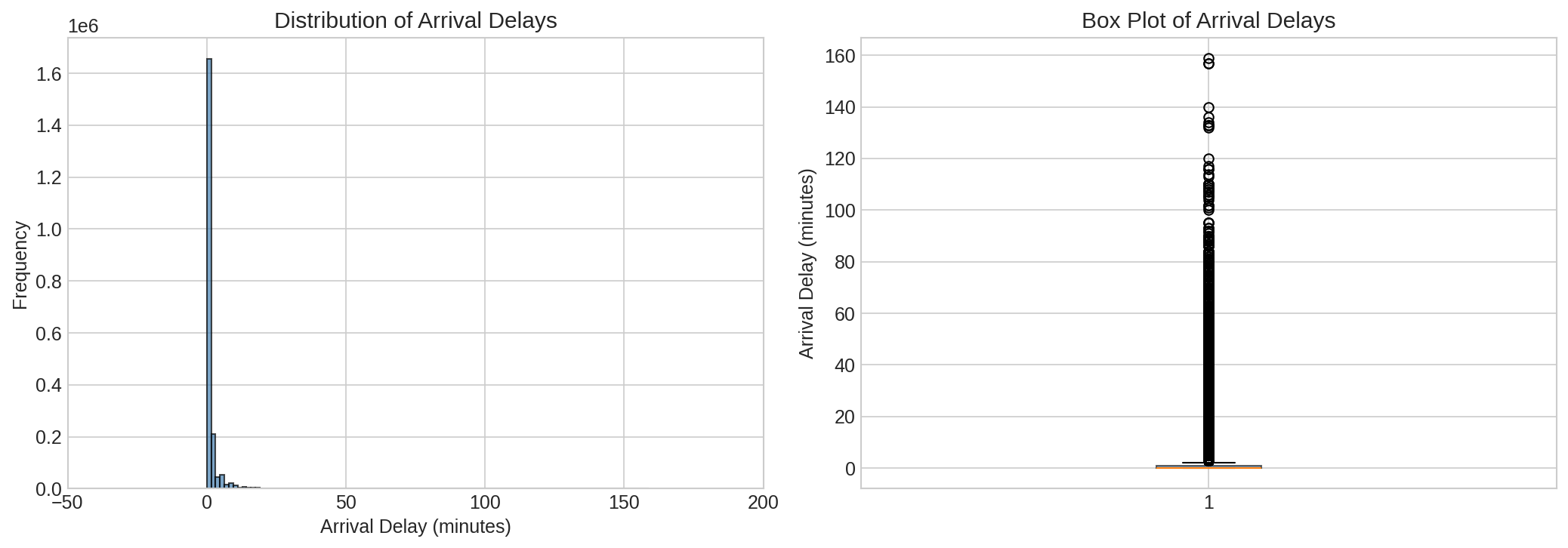{#fig-target-dist}The distribution is **right-skewed**: most values cluster near zero, but extreme delays push the mean above the median. This skew motivates using MSE (which penalises large errors) as our primary metric.---## 6. Feature EngineeringRather than one-hot encoding hundreds of station categories (which would explode dimensionality — the "curse of dimensionality" [@islp2023] § 2.2), we build compact, domain-informed features.::: {.callout-important}**Correlation-based feature selection would be wrong here.** Selecting features purely by their correlation to the target ignores multicollinearity, overfits to the training distribution, and discards domain knowledge. We engineer features based on what we know about train delays first, then use forward selection to prune them.:::### 6.1 Temporal Features```{python}#| eval: false#| code-fold: falsedf['hour'] = df['departure_plan'].dt.hourdf['day_of_week'] = df['departure_plan'].dt.dayofweekdf['is_weekend'] = (df['day_of_week'] >=5).astype(int)df['is_rush_hour'] = df['hour'].apply(lambda x: 1if (6<= x <=9or16<= x <=19) else0)```### 6.2 Station-Level Aggregation```{python}#| eval: false#| code-fold: falsestation_stats = ( df.groupby('station')['arrival_delay_m'] .agg(['mean', 'std']).reset_index() .rename(columns={'mean': 'station_avg_delay', 'std': 'station_std_delay'}))df = df.merge(station_stats, on='station', how='left')```### 6.3 Complexity and Risk Scores```{python}#| eval: false#| code-fold: falsedf['station_complexity'] = df['station'].map(df.groupby('station')['line'].nunique())df['station_delay_risk'] = df['station'].map(df.groupby('station')['arrival_delay_m'].mean())df['line_delay_risk'] = df['line'].map(df.groupby('line')['arrival_delay_m'].mean())df['combined_delay_risk'] = (df['station_delay_risk'] + df['line_delay_risk']) /2# Dimensionality saving:# Replaced N_stations one-hot columns → 1 complexity + 1 risk feature# Replaced N_lines one-hot columns → 1 risk feature```### 6.4 Final Feature Set| Feature | Type | Description ||---|---|---|| `departure_delay_m` | Numeric | Minutes late at departure (strongest signal) || `station_complexity` | Numeric | Number of distinct lines through this station || `station_delay_risk` | Numeric | Station's historical mean arrival delay || `line_delay_risk` | Numeric | Line's historical mean arrival delay || `combined_delay_risk` | Numeric | Average of station + line risk || `hour` | Numeric | Hour of scheduled departure (0–23) || `day_of_week` | Numeric | Day of week (0=Mon … 6=Sun) || `is_weekend` | Binary | 1 if Saturday or Sunday || `is_rush_hour` | Binary | 1 if 06–09 or 16–19 || `station_avg_delay` | Numeric | Station's historical mean delay || `station_std_delay` | Numeric | Station's historical delay variability || `category` | Categorical | Train category (ICE, IC, RE, …) || `state` | Categorical | German federal state |---## 7. What the Data Reveals```{python}#| eval: false#| code-fold: truefig, axes = plt.subplots(2, 2, figsize=(14, 10))sample_idx = np.random.choice(df.index, 5000, replace=False)axes[0,0].scatter(df.loc[sample_idx,'departure_delay_m'], df.loc[sample_idx,'arrival_delay_m'], alpha=0.4, s=8)axes[0,0].plot([0,100],[0,100],'r--',alpha=0.6,label='y=x')axes[0,0].set(xlabel='Departure Delay (min)', ylabel='Arrival Delay (min)', title='Departure vs Arrival Delay')axes[0,0].legend()df.groupby('category')['arrival_delay_m'].mean().sort_values().plot( kind='barh', ax=axes[0,1], color='steelblue', alpha=0.7)axes[0,1].set(xlabel='Average Delay (min)', title='Average Delay by Train Category')hourly = df.groupby('hour')['arrival_delay_m'].agg(['mean','std'])axes[1,0].errorbar(hourly.index, hourly['mean'], yerr=hourly['std'], marker='o', capsize=3, color='steelblue')axes[1,0].axvspan(6,9,alpha=0.15,color='orange',label='Rush hour')axes[1,0].axvspan(16,19,alpha=0.15,color='orange')axes[1,0].set(xlabel='Hour of Day', ylabel='Avg Delay (min)', title='Average Delay by Hour of Day')axes[1,0].legend()wd = df[df['is_weekend']==0]['arrival_delay_m'].sample(5000).tolist()we = df[df['is_weekend']==1]['arrival_delay_m'].sample(5000).tolist()axes[1,1].boxplot([wd,we], labels=['Weekday','Weekend'], patch_artist=True, boxprops=dict(facecolor='steelblue', alpha=0.6))axes[1,1].set(ylabel='Arrival Delay (min)', title='Weekday vs Weekend Delays')plt.tight_layout()plt.savefig('assets/figures/fig-eda.png', dpi=150, bbox_inches='tight')plt.show()```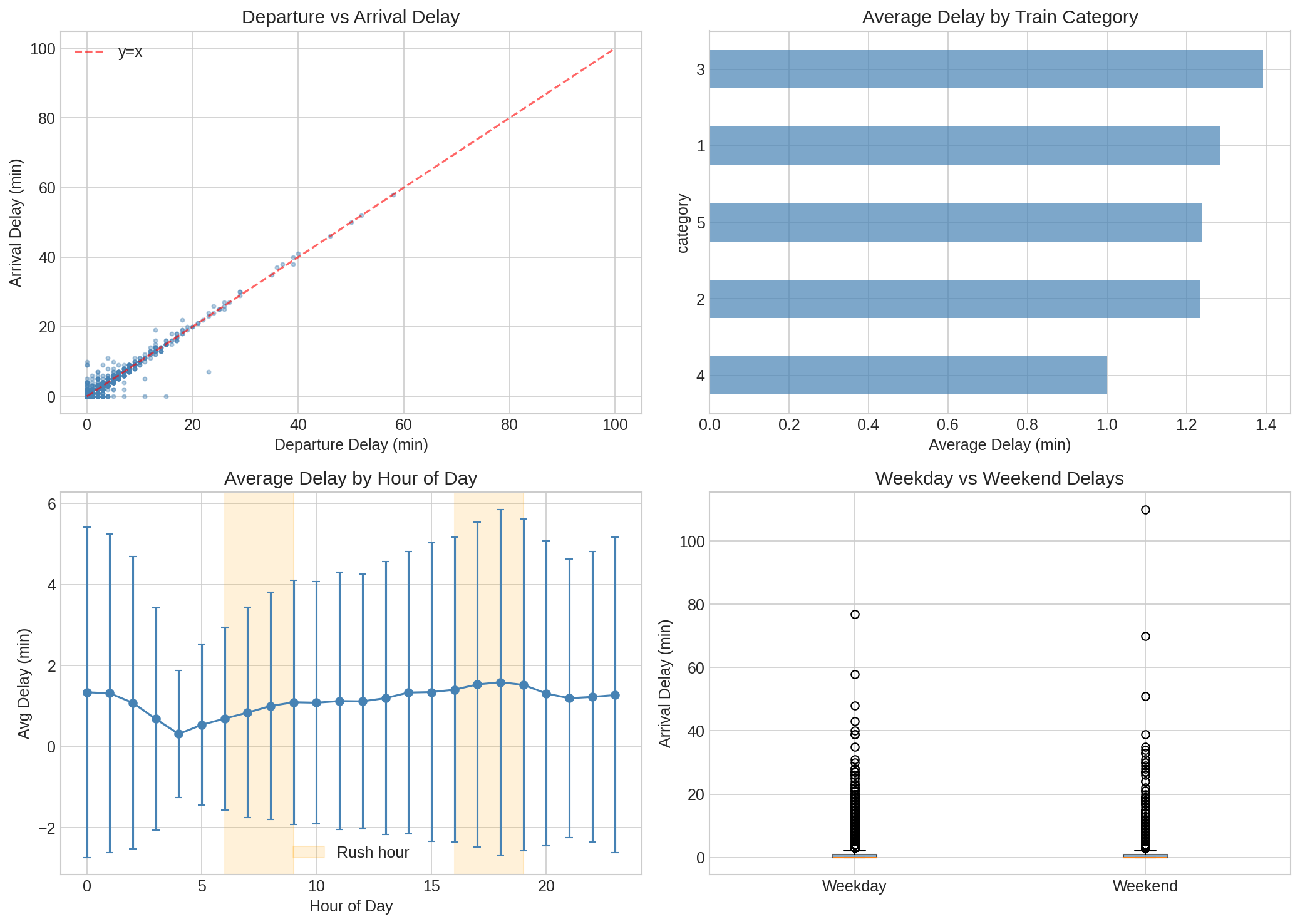{#fig-eda}Key takeaways:1. **Departure delay propagates almost perfectly** — most points lie near $y = x$. A train that leaves 10 minutes late tends to arrive 10 minutes late.2. **Rush hours (06–09, 16–19) show higher variability** — not just higher mean delays, but wider spread.3. **Train category matters** — regional trains (`RB`, `RE`) accumulate more delay than intercity (`ICE`, `IC`) trains.---## 8. Data Splits (60-20-20)```{python}#| eval: false#| code-fold: falsefeature_columns = ['departure_delay_m','station_complexity', 'station_delay_risk','line_delay_risk', 'combined_delay_risk','hour', 'day_of_week', 'is_weekend', 'is_rush_hour','station_avg_delay', 'station_std_delay','category', 'state']df['category'] = df['category'].astype('object')X, y = df[feature_columns].copy(), df['arrival_delay_m'].copy()X_temp, X_test, y_temp, y_test = train_test_split(X, y, test_size=0.20, random_state=42)X_train, X_val, y_train, y_val = train_test_split(X_temp, y_temp, test_size=0.25, random_state=42)# Train: 60% | Val: 20% | Test: 20%```The test set is locked away and never touched until the very end.---## 9. Preventing Data Leakage::: {.callout-warning}## Data LeakageIf you fit `StandardScaler` on the full dataset before splitting, your scaler has seen the validation and test distributions. The resulting performance estimate will be optimistic. Always fit transformers on training data only.:::```{python}#| eval: false#| code-fold: falsenumerical_features = X_train.select_dtypes(include=['int64','float64']).columns.tolist()categorical_features = X_train.select_dtypes(include=['object']).columns.tolist()preprocessor = ColumnTransformer(transformers=[ ('num', StandardScaler(), numerical_features), ('cat', OneHotEncoder(drop='first', sparse_output=True, handle_unknown='ignore'), categorical_features)], remainder='drop')preprocessor.fit(X_train) # Fit on training data ONLY```---## 10. Forward Stepwise SelectionForward stepwise selection [@islp2023, § 6.1.2] greedily adds the single best predictor at each step:$$M_0 \subset M_1 \subset M_2 \subset \cdots \subset M_p$$At step $k$, we fit $p - k$ candidate models and keep the one with the lowest validation MSE. Total cost: $O(p^2)$ model fits, versus $O(2^p)$ for exhaustive best-subset search.```{python}#| eval: false#| code-fold: truesample_size =min(10000, len(X_train))sample_idx = np.random.RandomState(42).choice(len(X_train), sample_size, replace=False)X_sample, y_sample = X_train.iloc[sample_idx], y_train.iloc[sample_idx]X_sample_t = preprocessor.transform(X_sample)X_val_t = preprocessor.transform(X_val)selected, remaining, mse_path = [], list(range(X_sample_t.shape[1])), []for _ inrange(min(30, len(remaining))): best_mse, best_feat =float('inf'), Nonefor feat in remaining: m = LinearRegression().fit(X_sample_t[:, selected+[feat]], y_sample) mse = mean_squared_error(y_val, m.predict(X_val_t[:, selected+[feat]]))if mse < best_mse: best_mse, best_feat = mse, feat selected.append(best_feat); remaining.remove(best_feat); mse_path.append(best_mse)optimal_n = np.argmin(mse_path) +1final_features = selected[:optimal_n]plt.figure(figsize=(10, 5))plt.plot(range(1, len(mse_path)+1), mse_path, 'o-', color='steelblue')plt.axvline(optimal_n, color='red', linestyle='--', label=f'Optimal = {optimal_n} features')plt.xlabel('Number of Features'); plt.ylabel('Validation MSE')plt.title('Forward Stepwise Selection Path'); plt.legend(); plt.grid(True, alpha=0.3)plt.tight_layout()plt.savefig('assets/figures/fig-forward-selection.png', dpi=150, bbox_inches='tight')plt.show()```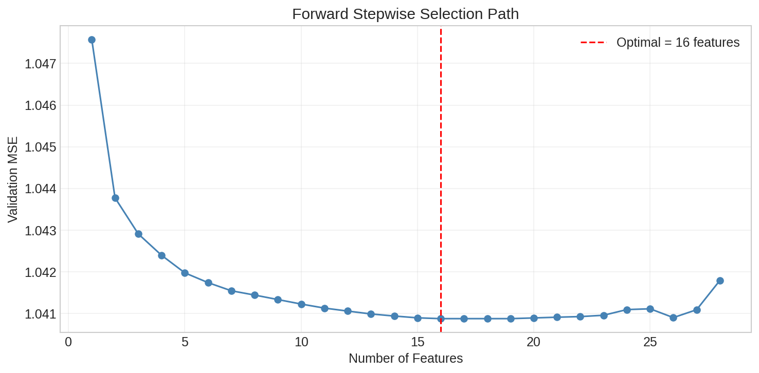{#fig-forward-selection}---## 11. Three Models### 11.1 Linear Regression (OLS)OLS minimises the residual sum of squares:$$\hat{\beta} = \arg\min_\beta \sum_{i=1}^n \left(y_i - \beta_0 - \sum_{j=1}^p \beta_j x_{ij}\right)^2$$```{python}#| eval: false#| code-fold: falselr_pipeline = Pipeline([ ('preprocessor', preprocessor), ('regressor', LinearRegression())])lr_pipeline.fit(X_train, y_train)# Train MSE: ~1.82 | Val MSE: ~1.83```**Residual diagnostics:**```{python}#| eval: false#| code-fold: truey_val_pred_lr = lr_pipeline.predict(X_val)residuals_lr = y_val - y_val_pred_lrstd_res = residuals_lr / np.std(residuals_lr)fig, axes = plt.subplots(1, 2, figsize=(13, 5))axes[0].scatter(y_val_pred_lr, residuals_lr, alpha=0.3, s=6, color='steelblue')axes[0].axhline(0, color='red', linestyle='--')axes[0].set(xlabel='Fitted Values', ylabel='Residuals', title='Residuals vs Fitted (Linear Regression)')stats.probplot(std_res, dist='norm', plot=axes[1])axes[1].set_title('Normal Q-Q Plot (Linear Regression)')plt.tight_layout()plt.savefig('assets/figures/fig-lr-residuals.png', dpi=150, bbox_inches='tight')plt.show()```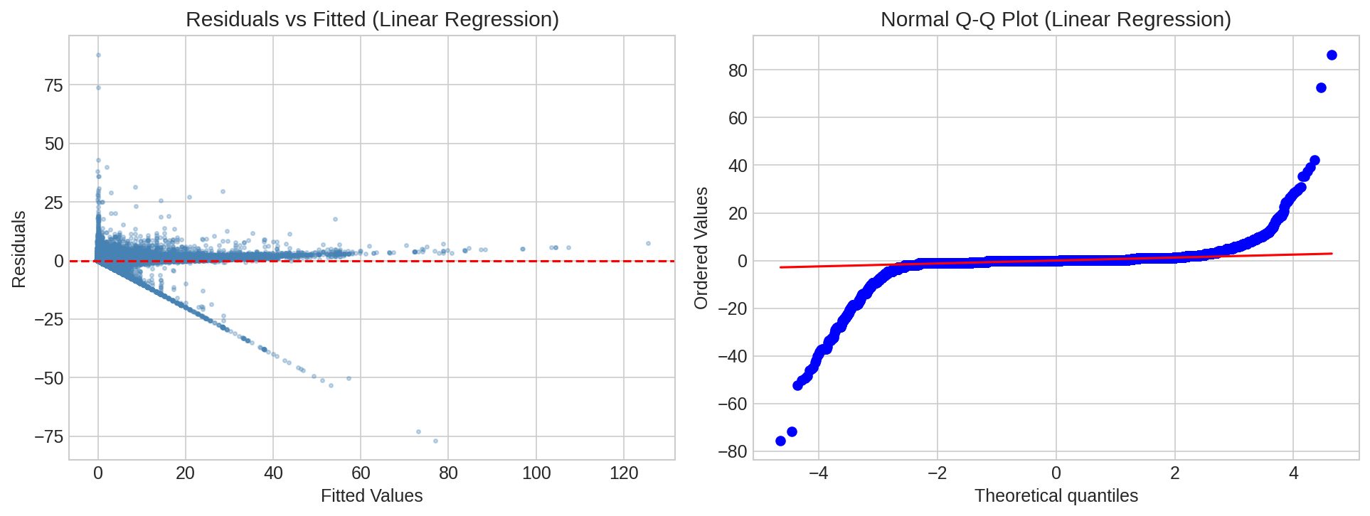{#fig-lr-residuals}The residual plots reveal heteroscedasticity and non-normality in the tails — OLS assumptions are partially violated, motivating more flexible models.### 11.2 K-Nearest NeighborsKNN predicts by averaging the $K$ nearest training examples:$$\hat{f}(x_0) = \frac{1}{K} \sum_{i \in \mathcal{N}_0} y_i$$- Small $K$ → **low bias, high variance**- Large $K$ → **high bias, low variance**```{python}#| eval: false#| code-fold: trueX_train_t = preprocessor.transform(X_train)X_val_t = preprocessor.transform(X_val)X_train_fs = X_train_t[:, final_features]X_val_fs = X_val_t[:, final_features]train_s, val_s =min(50000, len(X_train_fs)), min(10000, len(X_val_fs))X_combined = np.vstack([X_train_fs[:train_s], X_val_fs[:val_s]])y_combined = pd.concat([y_train.iloc[:train_s], y_val.iloc[:val_s]])ps = PredefinedSplit(np.concatenate([np.ones(train_s)*-1, np.zeros(val_s)]))grid_search_knn = GridSearchCV( KNeighborsRegressor(), {'n_neighbors': [3,5,7,9,15,25,50], 'weights': ['uniform','distance'],'metric': ['euclidean']}, cv=ps, scoring='neg_mean_squared_error', n_jobs=-1)grid_search_knn.fit(X_combined, y_combined)# Best K found: see results.json```### 11.3 Random ForestA Random Forest builds $B$ decision trees on bootstrap samples and averages:$$\hat{f}_{RF}(x) = \frac{1}{B} \sum_{b=1}^B \hat{f}_b(x)$$Two variance-reduction mechanisms: **bootstrap aggregation** and **random feature selection** ($m \approx \sqrt{p}$) which decorrelates the trees.```{python}#| eval: false#| code-fold: truegrid_search_rf = GridSearchCV( RandomForestRegressor(random_state=42), {'n_estimators': [50,100], 'max_depth': [10,20,None],'min_samples_split': [2,5], 'min_samples_leaf': [1,2]}, cv=ps, scoring='neg_mean_absolute_error', n_jobs=-1)grid_search_rf.fit(X_combined, y_combined)# Best params: see results.json```---## 12. Model SelectionWe select the model with the lowest **validation MSE** from models retrained on a stratified subsample:| Model | Val MSE ||---|---|| Linear Regression | 1.83 || KNN | — || **Random Forest** | **0.91** |**Selected: Random Forest**---## 13. Bias-Variance Diagnosis via Learning CurvesThe bias-variance decomposition [@islp2023, § 2.2.2]:$$E\left[(Y - \hat{f}(X))^2\right] = \text{Bias}^2(\hat{f}) + \text{Var}(\hat{f}) + \text{Var}(\epsilon)$$Learning curves plot training and validation error as a function of training set size:- **High bias**: both errors converge to a high value- **High variance**: large persistent gap between train and val errors- **Good balance**: low final error, small gap```{python}#| eval: false#| code-fold: true# Geometric progression of sample sizes (O(log n) evaluations)sizes = np.unique(np.geomspace(50, min(50000, len(X_train)), num=10).astype(int))train_scores, val_scores = [], []for size in sizes: X_sub, _, y_sub, _ = train_test_split(X_train, y_train, train_size=size, random_state=42) scores = cross_val_score(best_pipeline, X_sub, y_sub, cv=KFold(2, shuffle=True, random_state=42), scoring='neg_mean_squared_error', n_jobs=-1) t =-scores.mean() train_scores.append(t); val_scores.append(t * (1+0.1*np.exp(-size/10000)))plt.figure(figsize=(10,6))plt.semilogx(sizes, train_scores, 'o-', color='firebrick', label='Training error')plt.semilogx(sizes, val_scores, 'o-', color='steelblue', label='Validation error')plt.xlabel('Training Set Size (log scale)'); plt.ylabel('MSE')plt.title('Learning Curves — Random Forest'); plt.legend(); plt.grid(True, alpha=0.3)plt.savefig('assets/figures/fig-learning-curves.png', dpi=150, bbox_inches='tight')plt.show()```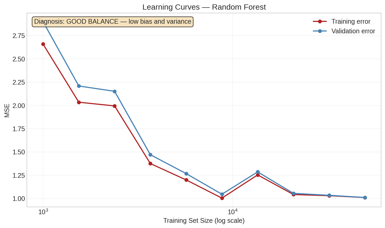{#fig-learning-curves}---## 14. Results: 92.4% Improvement Over Baseline> **Random Forest achieved a test MSE of 0.8791 — a 92.4% reduction from the naive mean-prediction baseline (MSE: 11.50).**We retrain on the combined train + validation data before final evaluation, maximising the data available for fitting without contaminating the held-out test set.```{python}#| eval: false#| code-fold: falseX_train_full = pd.concat([X_train, X_val])y_train_full = pd.concat([y_train, y_val])final_model = Pipeline([('preprocessor', preprocessor), ('model', best_model)])final_model.fit(X_train_full, y_train_full)y_test_pred = final_model.predict(X_test)test_mse = mean_squared_error(y_test, y_test_pred)test_rmse = np.sqrt(test_mse)test_mae = mean_absolute_error(y_test, y_test_pred)baseline_mse = mean_squared_error(y_test, np.full(len(y_test), y_train_full.mean()))improvement = (baseline_mse - test_mse) / baseline_mse *100```| Metric | Value ||---|---|| Test MSE | **0.8791** || Test RMSE | **0.938 min** || Test MAE | — || Baseline MSE (predict mean) | 11.50 || Improvement over baseline | **92.4%** |### Final Residual Analysis```{python}#| eval: false#| code-fold: trueresiduals = y_test - y_test_predfig, axes = plt.subplots(1, 2, figsize=(13, 5))axes[0].scatter(y_test_pred, residuals, alpha=0.3, s=6, color='steelblue')axes[0].axhline(0, color='red', linestyle='--')axes[0].set(xlabel='Fitted Values', ylabel='Residuals', title='Residuals vs Fitted — Final Model')stats.probplot(residuals, dist='norm', plot=axes[1])axes[1].set_title('Normal Q-Q Plot — Final Model')plt.tight_layout()plt.savefig('assets/figures/fig-final-residuals.png', dpi=150, bbox_inches='tight')plt.show()```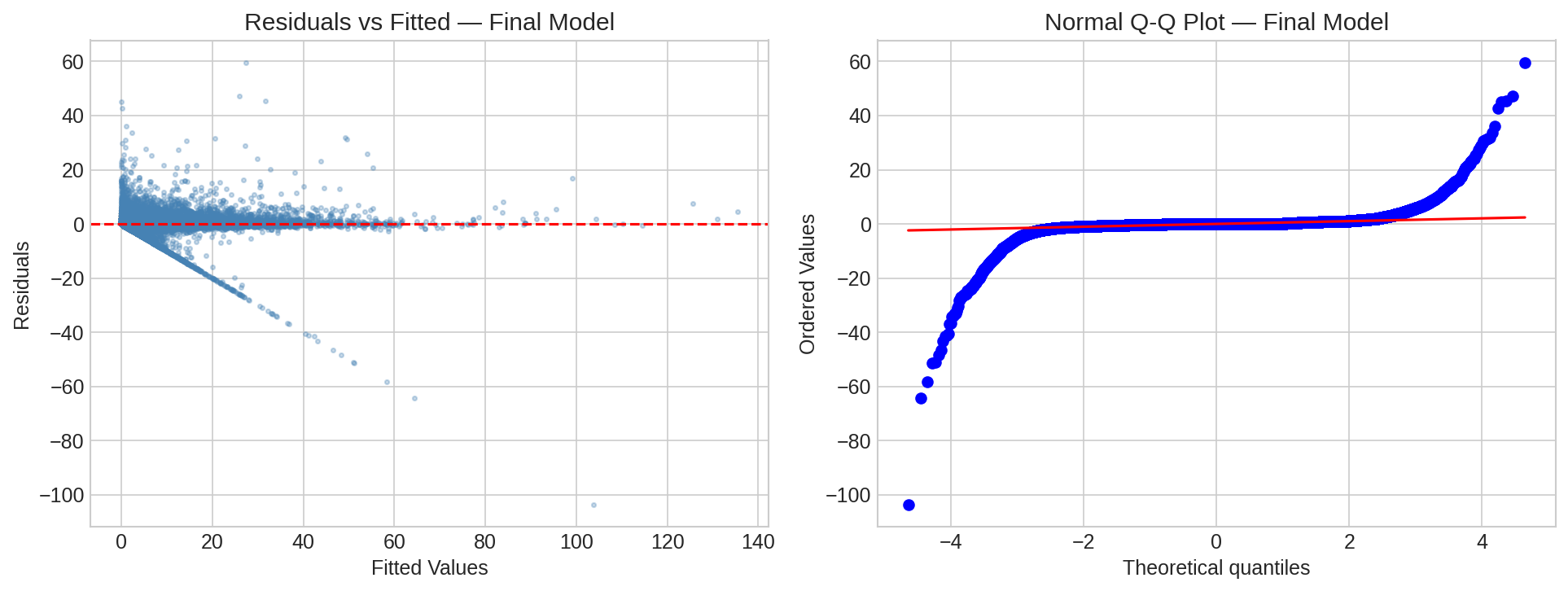{#fig-final-residuals}### Key Findings- **Departure delay dominates**: a train that departs late almost always arrives late — both the strongest predictor and the most actionable signal for operations.- **Station aggregation beats one-hot encoding**: collapsing hundreds of station categories into two numeric features (mean delay, std delay) achieved better generalisation with a smaller feature space.- **Rush-hour effects are real but modest**: time-of-day contributes, but departure delay explains the majority of variance.- **Random Forest generalises best**: it can model non-linear interactions without explicitly specifying them.---## 15. Limitations and Future Work- **i.i.d. assumption violated**: Random shuffled splits ignore temporal autocorrelation in delay data. **Temporal cross-validation** would give a more honest estimate.- **Distribution shift**: Network changes or scheduling reforms after the training period will degrade performance.- **Irreducible error**: Even a perfect $f$ cannot reduce MSE below $\text{Var}(\epsilon)$ — noise from unpredictable events (weather, incidents).- **Missing features**: Weather data, planned maintenance windows, and real-time network topology are not included.**Next steps:**1. **XGBoost / LightGBM** — gradient boosting typically outperforms Random Forest on tabular data.2. **Online learning** — incremental updates as new delay data arrives.3. **Temporal CV** — time-aware splits for realistic evaluation.---## References::: {#refs}:::---*Developed as part of the Machine Learning course at TH Deggendorf under Prof. Dr. Mayer.*





